Logos are more than just symbols on jerseys. They are the visual heartbeat of hockey culture. From the iconic crests of the Original Six NHL teams to the bold, modern marks of new expansion franchises, a logo tells a story of heritage, identity, and fan loyalty. In today’s NHL, logos serve multiple roles: they connect generations of fans, anchor merchandise and media branding, and act as rallying points for community pride. Whether it’s a classic maple leaf, a roaring mammoth, or a stylised knight’s helmet, each emblem carries meaning far beyond its lines and colours.
Yet hockey’s visual identity extends far beyond the NHL. Across Europe - in Slovakia, the Czech Republic, Sweden, Finland, Switzerland, and Germany - clubs craft logos that balance tradition with contemporary design, creating emblems that resonate on and off the ice. From throwback nostalgia in the NHL’s Reverse Retro programme and some of the best jerseys of all time to the timeless crests of SC Bern, HC Fribourg‑Gottéron, or Kölner Haie, hockey logos offer a rich study in branding, heritage, and visual storytelling.
This blog explores the evolution of logos, the most valuable marks, expansion teams carving their identities, defunct franchises, retro reinterpretations, and the standout emblems outside the NHL, offering insights into what makes a hockey logo truly iconic.

Karel Vejmelka with Nate Schmidt (Utah Mammoth), source: Profimedia
NHL Logos: Which Teams Are the “Original Six”?
The phrase “Original Six” in the context of the NHL refers to a specific group of six franchises that comprised the entire league for a 25-season span, from 1942 until the league’s major expansion in 1967. These six teams are:
-
Montreal Canadiens
-
Boston Bruins
-
Detroit Red Wings
-
Chicago Blackhawks
-
New York Rangers
Let’s break down some of the key reasons this grouping is significant - and what that means when we look at their logos and branding from a design / identity perspective.
Why “Original Six” and why it matters
While the term might suggest that these were literally the first six teams in the NHL, the reality is a bit more nuanced. The NHL was founded in 1917, and by 1942 many teams had entered, exited, folded or relocated. It was only from 1942 onward that the league stabilised with exactly these six franchises - no new teams entered, none exited - for a quarter-century.
Because branding and visual identity rely heavily on continuity, heritage and recognition, these six teams enjoy a unique status: their logos carry decades of history, loyalty, and legacy that newer franchises simply don’t have.
From a design standpoint, that means their logos are not only identifiers but cultural icons. When you see the winged-wheel of Detroit, the “C” and “H” of Montreal, the maple leaf crest of Toronto, the Native American head of Chicago, the bear “B” of Boston, or the diagonal “RANGERS” / shield of New York - you’re looking at marks that have evolved over decades while preserving heritage.

Zdeno Chára (Boston Bruins), source: THN
Montreal Canadiens
-
Founded 1909, joined the NHL in 1917.
-
The iconic “CH” crest (a “C” encircling an “H”) is one of the most enduring logos in sports.
-
Because of their long history and success, the mark has become synonymous with hockey tradition - an excellent example of brand heritage doing heavy lifting for identity.
Toronto Maple Leafs
-
One of the league’s oldest clubs - founded in 1917 (as the Toronto Arenas) and transitioning to Maple Leafs in 1927.
-
The maple-leaf motif staples national identity (Canada) and sports identity, which is powerful in brand storytelling.
-
For a designer or brand strategist, this is a textbook case of iconography + national symbol merged into a sports mark.
Boston Bruins
-
The first U.S. team to join the NHL (1924).
-
Their “spoked-B” logo is a standout: it combines bold typography, a tough silhouette, and reference to wheel/spoke imagery (evoking speed and movement) - a great example of multiple layers of meaning in a mark.
-
In logo design for sports, legacy marks like this show how simplicity + symbolism work long-term.

The Original Six, source: Ticketmaster Blog
Detroit Red Wings
-
Joined the NHL in 1926 (originally Detroit Cougars/Falcons before becoming the Red Wings).
-
The “winged wheel” is one of the most iconic marks - blending motion (wheel), flight (wing), and automotive heritage (Detroit’s “Motor City”). For a branding blog, this is a masterclass in mark design grounded in local context.
-
Their recently revealed centennial logo further reinforces how a strong original mark can be adapted while preserving legacy.
Chicago Blackhawks
-
Founded 1926, joined the NHL the same year.
-
Their mark - a profile of a Native American head inside a circle of colours - is distinctive, though also has faced historical discussion around cultural sensitivity.
-
From a logotype perspective, this shows how symbols can carry identity but require evolving brand conversations in a modern era.
New York Rangers
-
Also joined the NHL in 1926.
-
Their shield mark (and diagonal wordmark) is simple, strong, and fits the iconic branding of New York sports.
-
It shows how typography + geometric shapes (shield) can carry permanence in a sports brand environment.

The Original Six - modern logos, source: RinkHive Hockey History
Why this matters for branding and logo design
-
Heritage matters: A mark that lasts decades doesn’t just survive design trends - it becomes embedded in culture.
-
Local context + symbol: Many of these logos derive strength from local/regional history (Detroit = Motor City, Toronto = maple leaf, Boston = spoke wheel referencing steamboat era etc.).
-
Adaptation vs. overhaul: Most of these teams haven’t radically changed their core mark; rather they’ve refined it. That’s a lesson for brands - evolution often trumps revolution.
-
Recognition = equity: When you see the Red Wings’ winged-wheel, you instantly know the team; that recognition builds brand equity.
-
Culture & conversation: Some marks (e.g., Chicago) face modern reconsideration of imagery; so identity is not static. Good branding anticipates and adapts.

Dylan Larkin with Alex DeBrincat (Detroit Red Wings), source: NHL
How NHL Logos Evolve Over Time
When you look across more than a century of NHL history, the logos tell a visual story of the league’s evolution - from simple stitched emblems to globally recognized design icons. Each decade of hockey has left its fingerprint on how teams express identity, heritage, and pride through their marks. NHL logos have never been static. They’ve adapted to new eras of media, technology, and fan culture - and yet, most of them still stay rooted in tradition.
In the earliest years of the NHL, between the 1910s and 1940s, team logos were often simple and text-based. Limited printing and embroidery technology meant that most jerseys carried only letters, basic shapes, and minimal color. The Montreal Canadiens’ familiar “C-H” crest or the Toronto Maple Leafs’ early text-based marks were more functional identifiers than pieces of brand storytelling. The league’s own logo, introduced in 1917, was a simple wordmark on a shield - classic, minimal, and practical.
NHL logo evolution, source: SeekPNG
By the 1950s through the 1980s, things began to change. Teams realized the power of visual identity as television and merchandising grew. Logos became more symbolic and stylized - designed to stand out on screen and in print. The Detroit Red Wings’ winged wheel, the Boston Bruins’ spoked “B,” and the Chicago Blackhawks’ detailed head mark became synonymous with the sport itself. These were decades when the core DNA of NHL visual culture was set: bold forms, timeless color palettes, and emotional attachment through consistency.
The next big shift came with the league’s expansion and the graphic experimentation of the 1990s. New franchises entered the NHL with a clear mission - to be noticed. Clubs like the Mighty Ducks of Anaheim or the San Jose Sharks introduced sharp, modern logos that reflected pop culture, youth energy, and regional identity. Even established teams tweaked their looks with heavier outlines, metallic accents, and dynamic typography. It was an era of bold statements, where visual personality was as important as performance on the ice.
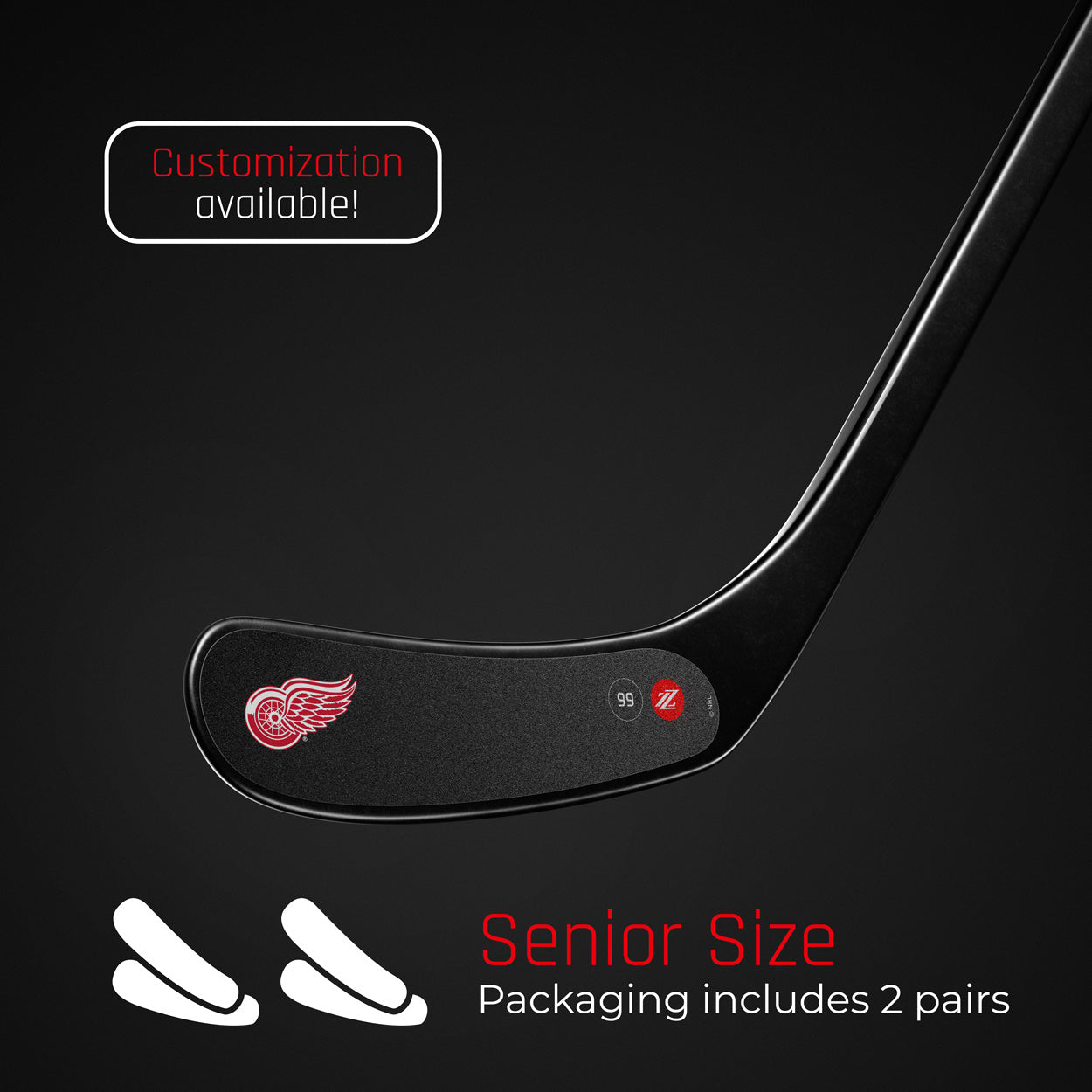
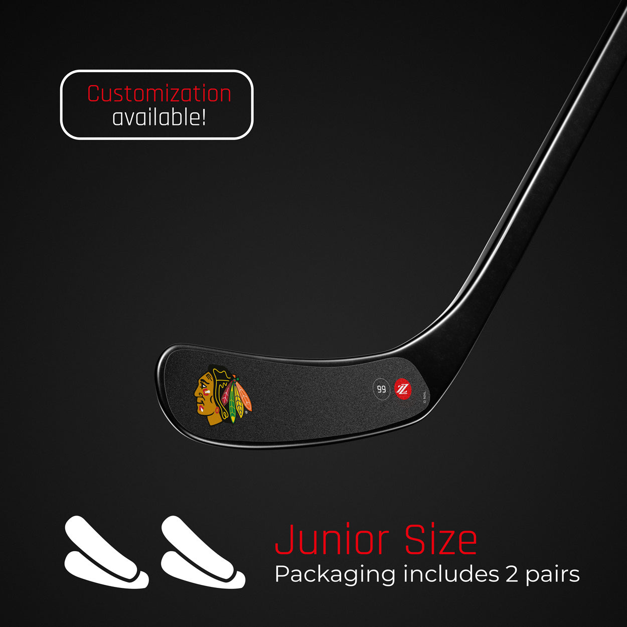
Products featured in this blog post


As the 2000s rolled in, the digital age reshaped logo design again. Suddenly, a team’s logo had to work not only on jerseys but also as an app icon, social media avatar, or 4K television overlay. Shading and gradients of the early 2000s eventually gave way to the flat, clean, and minimal aesthetic of the 2010s. Teams like the Florida Panthers and the Ottawa Senators refreshed their looks with simplified geometry and modern typography, while others like the Original Six preserved their marks with only subtle refinements. The NHL itself followed this trend in 2005, unveiling a sleeker, silver-toned shield that felt faster, lighter, and more contemporary.
What drives these changes? Several factors intersect. Media evolution is a big one - as the way fans consume hockey changes, logos must remain legible and recognizable across formats. Market growth and expansion mean teams have to appeal to new audiences and differentiate their identities. Merchandising plays a huge role, too: a fresh logo can ignite new jersey sales and fan engagement. And finally, heritage - perhaps the most powerful force in hockey branding. The league’s most iconic teams know that changing a logo isn’t just a design decision; it’s a cultural one.
Ultimately, the evolution of NHL logos mirrors the evolution of hockey itself - a balance between innovation and respect for history. Modern marks may be flatter, cleaner, and more digital-ready, but they still carry echoes of the past. For designers and brands like Rezztek, there’s a powerful lesson here: the best identities don’t abandon their origins - they refine them. Like a player sharpening his skates, each logo update is a fine-tuning process, ensuring that what’s classic stays competitive in a modern world.

Radko Gudas (Anaheim Ducks), source: NHL
Which NHL Team Logo is the Most Valuable - and Why?
When we ask “which logo is the most valuable,” it’s important to clarify: we aren’t just talking about the design mark, but the overall brand value of the franchise behind that logo. In other words, how much commercial, cultural and fan-equity power is embedded in that visual identity.
Based on recent valuation data, the franchise whose logo and brand appear to carry the most value is the Toronto Maple Leafs. According to the 2025 rankings, the Leafs top the NHL in franchise value at approximately US $4.25 billion. What that tells us is: the logo + identity system of the Leafs (and all the heritage, fan base, merchandising, media rights that go with it) is the “most valuable” in the league - at least quantitatively.

Anthony Stolarz (Toronto Maple Leafs) source: TSN
Why the Maple Leafs Logo & Brand are So Valuable
There are several factors that help explain why the Leafs hold that top spot:
-
Huge Market & Loyal Fan Base
-
Toronto is one of the largest hockey markets globally, and the Maple Leafs have a deep-rooted fan culture.
-
That translates into strong ticket sales, merchandising demand, sponsorship opportunities.
-
-
Iconic Logo & Heritage
-
The Maple Leafs’ logo - the stylised maple leaf symbol - itself is a strong visual anchor. It communicates “Canada”, “heritage”, “hockey tradition.”
-
Because that motif has been reinforced over decades (not radically redone, but refined), the logo carries recognition value.
-
This is a classic example: the strength of a logo lies in how much cultural and emotional equity it accumulates over time.
-
-
Merchandising and Licensing Power
-
A strong logo boosts merchandise (jerseys, hats, apparel), digital assets (avatars, emojis, social media) and licensing deals.
-
When a brand can extend its logo into many touch-points and fans buy it, that adds value.
-
-
Media & Sponsorship Leverage
-
Because the Leafs brand is so recognisable, they enjoy higher media rights value, better sponsorship deals, stronger corporate affiliations.
-
That lifts the “brand” value beyond just the visual mark, but the mark is the gateway.
-
-
Balanced Legacy and Modern Relevance
-
The Leafs’ mark is both historic (fans love the legacy) and relevant (still very visible, modern merch, strong brand activations).
-
That balance between heritage and modern application is a key principle in brand-driven logo design.
-

Toronto Maple Leafs' Logo: Evolution, source: TGaM
How New Clubs Compete Against the Originals
When you look at the modern era of the NHL, two of the most interesting branding battles are not only on the ice - they’re in how teams position their logos, identities and visual heritage. Expansion teams such as the Vegas Golden Knights, the Seattle Kraken, and now the Utah Mammoth face the unique challenge of carving out a distinctive identity while going up against clubs whose logos and brands have been around for decades.
Vegas Golden Knights: Rapid Brand Success & Legacy Building
The Golden Knights launched in 2017-18, and even though they were “new,” their branding launch was aggressive and meaningful. Their helmet-shape logo with a negative-space “V” for Vegas, colour scheme referencing gold (the state’s gold production), steel grey (strength), red (desert/skyline) and black (power) all communicated values and place.
On-ice success (they reached the Stanley Cup Final in their first year and won the whole thing in 2023) helped the brand credibility, but even the identity system was built so that it looked like it had purpose and history. This shows how a new entrant can shorten the “heritage time” by having a strong launch identity, bold design and clear narrative.

Tomáš Hertl (Vegas Golden Knights), source: TSN
Seattle Kraken: Building from Zero & Crafting Identity
The Seattle Kraken (entered the league in 2021-22) put a heavy emphasis on a unique identity from day one: their mark (a stylised “S” with a tentacle and a red eye) and colour palette (deep sea blue, ice blue, shadow blue, boundless blue + red alert) were chosen to reflect Seattle’s maritime heritage and mythology.
Because the Original Six teams benefit from decades of identity-recognition, the Kraken needed to make a splash early - not just visually but culturally. The franchise sold merchandise at a record pace for an expansion club, indicating how quickly a strong visual identity can accelerate brand equity.

Jordan Eberle (Seattle Kraken), source: Puck Pulse
Utah Mammoth: Launching a Brand in the Here & Now
Now enters the Utah Mammoth - a still-fresh expansion franchise (debut season 2024-25, permanent brand unveiled in May 2025) with one of the most interesting branding stories among recent NHL clubs.
Here’s what makes the Mammoth brand story stand out:
-
The franchise used a community-driven process: the name “Utah Mammoth” was chosen after a 13-month fan-voting process, with more than 850,000 votes cast.
-
Their logo - called the “Mountain Mammoth” - integrates multiple meaningful cues: the beast mid-charge (symbolising power), snow-capped peaks that reference Utah’s mountain ranges, the outline of Utah subtly embedded into the mountain silhouette, and the curved tusk of the mammoth which doubles as a bold “U” (for Utah).
-
Colour palette and design: They retained Rock Black, Salt White and Mountain Blue from their inaugural season; combined with custom typeface “Mammoth Sans” with a 10° forward slant (mirroring the slopes of the Wasatch Mountains).
-
The team plays in a major metropolitan area (Salt Lake City), shares the arena with the NBA’s Utah Jazz, and is building its identity rapidly. Wikipedia notes they are considered a new franchise (though technically the assets came via the previously-existing club) and that the permanent brand name was unveiled May 7 2025.

Nick Schmaltz (Utah Mammoth), source: THW
Brand-Value Gap: Originals vs. Expansion
The Original Six (the longstanding franchises such as Montreal Canadiens, Toronto Maple Leafs, Boston Bruins, Detroit Red Wings, Chicago Blackhawks and New York Rangers) benefit from decades of brand equity: familiar logos, storied history, fan loyalty, legacy merchandise and cultural recognition. Expansion clubs, by contrast, start with a blank slate in many ways. They must work harder in identity, visibility, merchandise - and they can’t lean on decades of recognition.
The Mammoth show that you can build brand equity fast if the story is strong, the design is meaningful, and you engage fans early. They challenge the notion that “heritage = only value for old clubs.” Modern branding can accelerate recognition and loyalty. However, The Originals still have a major head-start - their logos are instantly recognised by generations of fans, they have deep merchandising channels, and strong legacy.

Golden Knights v Mammoth, source: THN
Club Logos That Are No More : The Departed Identities of the NHL
Quebec Nordiques
The Quebec Nordiques were a beloved Canadian franchise, playing in the NHL from 1979 to 1995 (after a stint in the WHA). Their primary mark - the stylised red “N” formed like an igloo-top with a small blue circle, plus the fleur-de-lis in the jersey cuffs - remains one of the most iconic defunct logos in hockey.
The franchise relocated to Denver in 1995, becoming the Colorado Avalanche. The logo still resonates strongly with fans, sometimes used as a throwback or alternative mark even after relocation. From a branding view: the heritage of a logo can survive beyond the franchise exactly because of emotional attachment and visual distinctiveness.

Peter Šťastný (Quebec Nordiques), source: NHL
Hartford Whalers
The Hartford Whalers played in the NHL from 1979-80 until 1996-97, when they moved and became the Carolina Hurricanes. The logo - cleverly combining a “W” (for Whalers) and negative-space “H” (for Hartford) under a whale-tail shape - is frequently held up as a design classic.
Financial issues, arena concerns and city market size contributed to the relocation to North Carolina. The Whalers mark is still highly “collectible”, loved by fans and designers alike. For branding: An identity that uses clever symbolism (like the negative-space “H”) can transcend its original context.

Jordan Staal (Carolina Hurricanes) in Whalers' uniform, source: CT Insider
Atlanta Thrashers & Arizona Coyotes
This is a more complex case of relocation, rebranding and identity evolution. The Atlanta Thrashers were an NHL franchise from 1999 to 2011. They relocated to Winnipeg and became the “new” Winnipeg Jets. Meanwhile, the original franchise lineage of the Winnipeg Jets (1972-1996) had moved to Phoenix and then Arizona, becoming the Arizona Coyotes.
Atlanta → Winnipeg (Thrashers became Jets). Winnipeg original Jets → Phoenix/Arizona Coyotes, and in 2024 significant franchise changes occurred. The Thrashers logo (with the bird and hockey stick) is largely “retired” in the NHL context. The Coyotes’ “Kachina” style logo (one of the best ever NHL jersey ever made) has become a cult favorite and even returned as a primary mark in 2021. This shows how relocation and franchise moves muddy the continuity of logo identity and heritage - there’s a risk of losing brand equity if the mark is forgotten or ownership rights complicate use.

Atlanta Thrashers Jerseys, source: Reddit
Retro Versions of the Logo: Top Reverse Retro Logos
When you examine the modern era of the NHL branding efforts, one of the most interesting phenomena is the “Reverse Retro” programme: alternate sweaters (and by extension alternate versions of logos) that tap into past eras, heritage colour-schemes and throwback designs. The intent isn’t just nostalgia- it’s strategic: to reignite brand equity, engage fans with history, and give the core identity a fresh spin while staying grounded. These retro versions demonstrate how a well-established brand can revisit its roots, revive visual assets, and re-energise fan and consumer engagement without abandoning the core mark. Below are three standout examples of teams that have done this particularly well.
The NHL Reverse Retro programme has brought a fresh layer of creativity to the league’s visual identity, giving teams a chance to revisit and remix their past while engaging fans with something unexpected. Among the standout designs, a few have consistently captured attention for their clever use of colour, historical reference, and visual impact. The Colorado Avalanche, for instance, leaned into their Quebec Nordiques roots, blending royal blue and white with the Avalanche identity to create a throwback that feels both nostalgic and modern.

Colorado Avalanche Reverse Retro, source: NHL
The Florida Panthers’ light‑blue alternate recalls South Florida’s unique environment and original motifs, while the Vegas Golden Knights reimagined what their logo might have looked like in a 1990s context, with stylized fonts and stars evoking classic Las Vegas flair. Other notable reverse‑retro jerseys and logos include the Boston Bruins’ classic black and yellow revival, Toronto Maple Leafs’ clean white‑and‑blue reinterpretation, the New York Rangers’ vintage striped throwback, and the Chicago Blackhawks’ alternate featuring bold red and green accents reminiscent of their 1930s style.
How NHL Jerseys Are Made / source: YT/CTV News
These designs are more than just aesthetic experiments; they show how brands can leverage heritage while appealing to contemporary audiences. From the St. Louis Blues’ powder‑blue retro, to the Montreal Canadiens’ subtle nods to early‑era typography, and even the Tampa Bay Lightning’s high‑contrast black‑and‑blue reinterpretation.
Reverse Retro logos demonstrate a careful balance between recognition, nostalgia, and excitement. By highlighting the past in a contemporary package, the league not only boosts fan engagement but also reinforces the enduring power of visual identity. For brands and designers, these initiatives serve as a masterclass in how heritage can be refreshed without losing the essence that made the mark iconic in the first place.

Montreal Canadiens Reverse Retro, source: NHL
The Best Logos Outside the NHL
Hockey branding isn’t limited to the NHL - across Europe, teams have created striking, memorable logos that combine heritage, regional identity, and bold design. In Slovakia and the Czech Republic, clubs like Dukla Trenčín, HK Nitra, HC Sparta Praha, and HC Kometa Brno showcase emblems that are instantly recognisable to local fans, with stylised animals, shields, and team initials that convey pride and tradition.

HK Nitra, source: IG/HK Nitra
In Sweden and Finland, teams such as Färjestad BK, Frölunda HC, Tappara Tampere, and TPS Turku demonstrate how clean, modern graphics paired with classic colour schemes can create a strong visual identity that resonates both domestically and internationally.

Kometa Brno in Champions Hockey League, source: X/Kometa Brno
Switzerland’s top leagues also boast remarkable logos. SC Bern, HC Fribourg‑Gottéron, EV Zug, and EHC Biel/Bienne all blend traditional crests with contemporary elements, producing marks that are both timeless and dynamic. Even German teams like Kölner Haie or Finnish clubs such as SaiPa Lappeenranta contribute to a visual landscape rich with creativity.

HC Fribourg‑Gottéron, source: IG/HC Fribourg‑Gottéron
Across these leagues, the emphasis on heritage, local symbolism, and bold typography mirrors the NHL’s approach, proving that great logo design is universal - and that European hockey teams can inspire both fans and designers with their visual storytelling.


 NHL 2025–26 Season Preview: Can the Panthers Three-Peat? Marner, Nazar & Mammoth

 Hockey Hall of Fame Class of 2025: Legends, Legacy and What Comes Next